Wednesday, October 24, 2007
Final

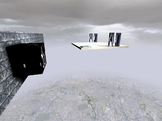
Tata's office is more plain compared to Zhang's. Its alot more solid which represents his company and the steel truss is an added touch which links the office to his product.

Bridge leading to Zhang's office. Zhang's company is called Paper Dragon and it has a fragile feel to it. Therefore i created Zhang's space to be more open and added a roof which is similar to that of Chinese palaces.

I kept the meeting place simple and added the water effect around da edge to create a calm atmosphere which is appropriate for a meeting.

This screenshot just shows the formation of the path of the elevator. This is suppose to represent the way the clients reached success; paving their own path to success rather than been born with a silver spoon in their mouth.

The front desk of Zhang's office. The large windows is a cliche symbol of power.

The lightin in this corridor is really nice and I tried to make it feel like a transition from one space to another.
Drafts
Tata's Office
Zhang's Office
Tuesday, October 9, 2007
Elevator
Tuesday, October 2, 2007
Subscribe to:
Comments (Atom)


